It is no longer news that more and more people are accessing the internet from their mobile devices. In fact, according to a study by Statista, the number of mobile internet users is projected to reach 6.9 billion by 2025. With this in mind, it’s essential for businesses to ensure that their websites are mobile-friendly and easily accessible on all devices. This is where responsive design comes in.
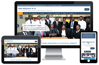
Responsive design is an approach to web design that ensures that a website adjusts its layout and content to fit the screen of the device that it is being viewed on either vertically or horizontally. This means that whether a user is accessing a website on a desktop computer, tablet, or smartphone, the website will automatically adjust to fit the screen size, providing an optimal viewing experience.
The importance of responsive design can be broken down into several key areas.
Responsive design is essential for improving user experience. When a website is not optimized for mobile devices, users may have a difficult time navigating the site and finding the information they need easily. This can lead to frustration and ultimately result in the user leaving the site. With responsive design, the website automatically adjusts to the device being used, making it easy for users to navigate and find the information they need.
Responsive design is also essential for improving search engine rankings. Search engines, such as Google, take into account the user experience when ranking websites. If a website is not mobile-friendly, it may be penalized in search engine rankings. A website that is optimized for mobile devices, on the other hand, is more likely to rank higher in search engine results pages (SERPs). This means that a website with a responsive design is more likely to be seen by potential customers.
Another key benefit of responsive design is that it can help to reduce bounce rates. Bounce rate is the percentage of visitors who leave a website after only viewing one page. When a website is not mobile-friendly, users may leave the site after only viewing one page, leading to a high bounce rate. With responsive design, the website automatically adjusts to the device being used, making it easy for users to navigate and find the information they need, reducing bounce rate.
In addition, responsive design can also be beneficial for businesses that rely on e-commerce. With more and more people shopping online using their mobile devices, it’s essential for e-commerce websites to be mobile-friendly. With responsive design, e-commerce websites can ensure that their products are easily accessible and easy to purchase on all devices, leading to increased sales.
Finally, responsive design can also help businesses to stay ahead of the competition. With more and more businesses recognizing the importance of mobile-friendly websites, those that do not have responsive design may be at a disadvantage. By implementing responsive design, businesses can ensure that their website is easily accessible on all devices, keeping up with the competition.
In conclusion, responsive design is essential for any business that wants to ensure that its website is easily accessible on all devices. It is important for improving user experience, search engine rankings, reducing bounce rate, saving time and money, being beneficial for e-commerce, and staying ahead of the competition. With more and more people accessing the internet from their mobile devices, it’s essential for businesses to ensure that their websites are mobile-friendly and easily accessible on all devices. Implementing responsive design can help businesses to achieve this goal and stay ahead of the competition


